Branding : Interactive and compostable packaging
UID : 2015 : 1 Week
Redesign Plantation chocolate's existing packaging
I was afforded the opportunity to work with a local Swedish chocolate company for a one week packaging redesign and branding. The deliverables for the project were:
a giftbox – where some of the chocolate products can be combined
the closure of today’s chocolate bars (today they get ripped when opened and can’t be reclosed...)
“Plantations Chocolate works with the local Ecuadorian cocoa farmers and teaches them techniques that will not only improve the taste of the chocolate but also it’s value as an export.”
WHAT IS PLANTATION CHOCOLATE?
Plantation Chocolate is a chocolate producing company with a focus on providing the highest quality chocolate possible. In the pursuit of this goal the company has developed strong relationships with local Ecuadorian farmers. While the company's focus is producing chocolate, a very large part of the company's mission is to improve the way in which the cocoa trade operates.
To them this begins and ends with how the cocoa beans are grown and produced. There is a sense of responsibility to the way the product is produced that is often lacking in this industry. The chocolate they produce is also deeply rooted to their local. Nearly half of the chocolate that is produced by them contains some sort of local ingredient.


Bean to bar
What separates Plantations Chocolate from other chocolate producers is that they are dedicated to the bean to bar process. Bean to bar references chocolate producers that are involved in the entire process from farming to creating bars of chocolate rather than merely melting and mixing chocolate produced in another factory. Plantations works directly with cocoa farmers and teaches them fermenting techniques that drastically improve the beans before they are even sold to chocolate producers.
Local Ingredients
In order to better make this chocolate Swedish and connected to the location of production there is a conscious effort to infuse this Ecuadorian chocolate with Swedish tradition. Through oral history and experience local edible plants are mixed into the chocolate. An example of this process is the use of Kvanne, or Angelica. One thing being lost today in Swedish society is the knowledge of edible plants like Kvanne. In an effort to rekindle this knowledge Plantations includes this ingredient in their chocolate, though it helps that it adds a great flavor. This aspect of the company is very positive and should be highlighted in any packaging redesign.
Factory tour
In order to gain a better understanding of what truly represents Plantations Chocolate our class was able to visit the factory in which all the chocolate for the company is produced. The first thing that stands out is how small and local the company is. With only a hand full of staff the operation is very small and the amount of passion for chocolate is palpable. This dedication to producing chocolate locally and often times with local ingredients feeds strongly into the brand's identity.
Sustainability
After having a meeting with the owner, Jenny Berg, it was made very clear that the mission of having a positive impact on the chocolate industry would be achieved through education and a sustainable approach to farming. The relationship with the local farms allows the customers to be assured that the chocolate is sustainable, high quality and responsible.
Packaging that represents the Brand messaGE
After conducting research on what the brand was aiming to accomplish with their product I focused on creating a packaging that illustrated illustrated these goals. In order to have a successful representation of Plantations Chocolate a packaging must be designed that incorporates:
HIGH QUALITY, SUSTAINABILITY, RESPONSIBILITY, AND LOCAL


INCORPORATE LOCAL ARTIST
As a way to strengthen the connection between the chocolate and the local in which it was produced, a local artists' work could be used. Landscape paintings would be ideal as it would imbue the chocolate with a sense of heritage and authenticity. The existing packaging utilizes the artwork of a painter from Ecuador and this packaging is beloved by the current consumer. By having another painting inspired design would help with the continuity of the brand's image. It would represent a design evolution rather than a departure.
SEED PAPER PACKAGING
Due to the fact that the packaging designed would be entirely compostable, an opportunity arises. I chose to use this fact to further connect the product to the mission of the company. Plantations Chocolate has made their educational relationship with cocoa farming fairly central to their brand's image. Playing on this and the company's frequent use of local plants I thought to myself, "Why can't we bring this aid and education to the local residents, consumers, and amateur farmer?". By using seed paper with local plants used like Kvanne, the user is able to grow their own home gardens or just beautify their surroundings with a little guerrilla gardening. All of this made possible by the fact that the packaging is entirely compostable.
COMPOSTABLE PACKAGING
The existing packaging had a beautiful exterior, but right when the consumer opened the chocolate bar they are confronted with a shiny plastic wrapper. After reading about how the company cares so much about sustainability and responsibility on the package, there is a bit of disconnect between the product and packaging with the wrapper. Instead it would be much more impactful if the packaging was as beneficial as the chocolate itself. Using a compostable plastic like NaturFlex, the same packaging efficiency could occur and truly provide a more enjoyable chocolate eating experience. The fact that the packaging would be entirely compostable would be indicated in the product description as well as a "please compost" logo.
Ingredient specific packaging
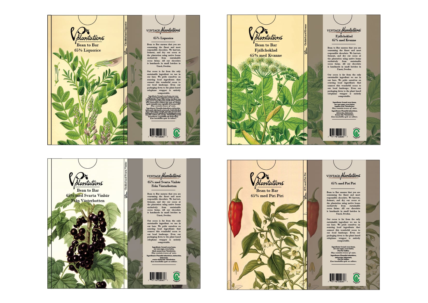
On the chocolate bars that have specific or specialty ingredients I decided to highlight this by utilizing scientific illustrations of the ingredients in the packaging design. By doing this the consumer can easily identify what the chocolate bar contains.


PACKAGE CONSTRUCTION
In order to make the packaging easily resealable, I decided to construct the package using a sleeve type cover. The chocolate would be sealed using compostable plastic and wrapped in a paper sleeve. The design of this sleeve would be a topographical map of Ecuador and contain a mission statement from the company. The outer cover would be either a local artist work or a scientific drawing depending on the bar.
FINAL DESIGNS
Individual bars
I separated the chocolates in the company's line into two groups of four. The first four are purely chocolate with no added ingredients. They only vary in the percentage of cocoa. For these I chose to utilize the work of a local artist named Gunnar Kalen. The second set of four are bars that have a specialized ingredient. For these I highlighted this by using a scientific illustration of the added ingredient.

Gift Pack
For the gift pack I wrapped the newly redesigned chocolate bars in a seed paper sleeve. Once the chocolate is consumed the user can rip up the wrapper and toss it into their garden. Within this wrapper is an assortment of seeds of local flowers and ingredients from the chocolate. The user is being gifted not only high quality and responsible chocolate, but also a start for a home garden.
